The Linux Desktop Distribution of the Future Part 4
Category: Conceptual Design
This article is part of a four part series intended to provide some thought into how a future Linux Desktop might work. It is not intended to be a comprehensive essay, although all the concepts presented here are considered "doable" by the author.
Part 1: Linux and the Desktop Today
Part 2: Applications
Part 3: File Management
Part 4: The Desktop Interface
Part 4: The Desktop Interface
In the final edition of this series, I'll tie together the technologies previously discussed, and explain how they might coexist in an easy to use desktop environment.
The Layout
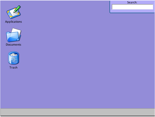
When a user attempts to be productive with his computer, there are usually only a few types of files he's interested in: Application and Documents. The Applications are the programs he uses to work with his documents. Just about everything else that a user does is intended to support this functionality. For example, the user has no direct need for a trash can. Rather, the trash is an abstraction that allows him a second chance before permanently deleting a set of files.
As a result, the only things that should be on a user's desktop are:
1. An icon to access his applications.
2. An icon to access his documents.
3. An icon to access his trash.
4. Any special mounts such as CDROMs, Network Drives, Cameras, USB Storage Devices, etc.
Everything else should be kept off the desktop. In particular, it is rather important for the system to NOT have desktop shortcuts in order to prevent the common glut of special offers and installers.
For the purposes of easy to access files, it is in the user's interest to allow selected files to appear on the Desktop. In the proposed interface, the Desktop would be merely a label used by the system to identify which files should appear. As a result, the right click menu and/or toolbars can provide the user with the option to add or remove the file from the Desktop. The key difference between how this would work in a DBFS vs. a regular system, is that the file is never moved in a DBFS. If the file is already organized, it will not have to move to appear on the Desktop. Rather, the file simply has the Desktop label added. Removing that label would have no effect on the file other than to make it disappear from the desktop area.
The two other key items on the Desktop are the search box and the task bar.
Applications
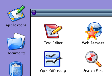 Clicking on the Applications icon pops up a file browser displaying the contents of the Applications label. This label can theoretically contain anything, including sub-labels, but will hold all applications by default. In the filters section we'll discuss a method by which applications can automatically end up here.
Documents
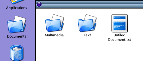 The Documents icon shows a file browser of the root of the label tree. Uncategorized files show up in the root, while any file with at least one label can be found underneath the selected label(s). The Applications and Trash labels are automatically weeded out to keep the user from getting confused. Note that what is displayed is not the true root of the filesystem. Rather it is a virtual root consisting only of files and labels that have no parent. No true hierarchy exists in a database file system, so the label and file information is used to compute one.
A special "label" called "Users" should show up under here, with a set of sub-labels for all users of the system. Everything beneath the user's name is part of their DBFS files and meta-data.
Trash
 As mentioned previously, files intended for deletion are simply labeled with the "Trash" label. Unlike other labels, however, any file with the Trash label should be automatically hidden from the file browser unless the Trash is being explicitly stored. Should the user decide to rescue the file from the trash, the system merely needs to remove the Trash label from the file in order to restore its full set of labels and attributes. Should the user decide to empty the trash, only then is the file actually deleted.
Note that at no time is the file actually moved or modified. The "move" to the trash can is merely an illusion designed to provide a mechanism similar to the trash can in today's OSes, but far more robust thanks to the ability to leave the file in place.
Search Box
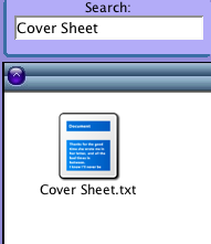 The search box in the upper right hand corner is a search like Apple's Spotlight and a command line box rolled into one. If the box detects that you have typed an absolute path, it will bring up a file browser window regardless of the fact that it's outside of the DBFS. This provides the user with a way to browse the system files if he so desires without resorting to a terminal program. The search box can also have a URL or URI entered to directly access an Internet site or shared network drive.
In all other circumstances, the search box will automatically search all files on the DBFS, sifting through indexes and meta-data to find any and all matches. Since this query can effectively be pushed down to the DBFS, the concept is that it would be tremendously fast because of the DBFS indexes.
Future enhancements to the search box might allow for more complex functionality such as quick commands to run programs, web searching, program interfaces, dictionary lookups, and other features similar to the way that Google provides a combined search and command line today.
Another important feature to include in the Search, is a method by which the search can be saved as a pseudo-folder. In reality the search should be nothing more than a file on disk that opens to the search results window (thus allowing the file to accept regular labeling and meta-data additions), but the icon for the saved search would make it appear to the user that the search is a special type of folder.
Taskbar/Dock

It is generally agreed by all modern UI experts that there must be a sensible method for the user to view and access all open program windows. The most popular of these methods has long been the Windows Taskbar, which shows a button for each open Window. To date, nothing has been found wrong with this interface other than potential usability issues that result when the user has an overcrowded taskbar. Still, it's a familiar interface for most users.
Similarly, the Dock is very well known to users of Mac OS X. The Dock interface provides a solution to overcrowding by automatically scaling icons so that all the icons can be seen on the screen at once. The icons are never too small, because they regrow as the user moves the mouse over them. This allows the user to manage hundreds of programs with the flick of a mouse over the Dock.
So which is better? The answer is: Whichever one you prefer. Some people prefer the Windows method and some people prefer the Mac method. As a result, this is one of the few places where giving the user an option makes a big difference. i.e. Let the user choose which one he wants. They're similar enough to implement via the same methods, and this desktop has no extra baggage to differentiate either design at an API level.
Filters
Anyone who has ever used email can tell you that the ability to setup rules on incoming email is an invaluable method for organizing and managing your email. GMail users can tell you that when combined with Labels instead of folders, those rules (called Filters in the GMail system) become even more valuable than before. For example, in GMail you can automatically organize your email under the proper labels, but still see the email in your inbox prior to archiving it. This saves a great deal of time, as the user does not have to check each email folder individually.
When applied to downloaded files, this raises an interesting question. Why don't web browsers have rules to automatically organize downloaded files? Surprisingly, the answer is the same as with email rules for folders. By setting up a rule, an email bypasses any sort of holding area (the inbox in most cases) where the user can be easily informed of its existence. Users have enough trouble attempting to find their downloaded files today without running into problems with files automatically moving to God knows where.
Yet just like with email, the problem goes away when labels are introduced. A file can be automatically organized under a label without removing it from a "downloaded" label or the Desktop. Smart software could even auto-manage the user's downloads by automatically removing a file that's linked to another label after a given period of time.
The best implementation of this is to push the rules down to the filesystem level. When a new file is created, the DBFS will check the filters and if any apply, use them to automatically apply labels to the file. For example, if I create a new SXW document, I could have a rule that would automatically place the document under the "Word Processing" label. Nothing prevents me from later adding a project-specific label, but with the filter in place I know that I can always find all of my SXW documents in one place. Similarly, I can set a filter stating that all MPG files with the words "Star Trek" in the name should be placed under the "Videos" and "Star Trek" labels.
The power that such a system as this gives the user cannot be overstated. While search can reduce the amount of time a user spends looking for a file, filters all but make organization unnecessary. If a type of file isn't properly trapped by the system, the user can always add another filter.
File Save Window
Since this new Desktop and Filesystem paradigm does away with the previous concept of directories, it becomes important that the File Save dialogs be updated to reflect this shift. While the old boxes will work fine for a time (as they will see the labels as if they were directories, and the DBFS will automatically assign the selected label), a more robust solution would be a save dialog that shows you the labels in the system, and allows you to build a list of them in addition to giving the file a name and file type.
This could be implemented for many current applications by modifying the existing GTK and QT file choosers. Unfortunately, the remaining applications would need to be modified to fully support the new Labeling system. Not to worry, however! Even with applications that are unable to break out of the legacy file choosers, file system filters will still allow users to automatically organize their system despite a given program's failings.
Filter Manager/Control Panel/Network Browser
One of the greatest crimes against good UI design was the attempt to move "common" functionality directly into the Desktop metaphor. Such functionality only served to confuse users and complicate the interface. Yet integrating such functionality was almost required in order to keep the user from having to sort through dozens of menu choices before finding the actual system options.
Thanks to the Applications as Files scheme, there is no need for the user to have to put up with this any longer. Functionality such as the Control Panel, Network Browser, and other system features should show up as "just another application". If the user is savvy enough to know they need these apps, the user is savvy enough to look in the Applications label to find them.
Which isn't to say that other programs might not invoke them. The key is that the interface is only provided when it makes sense, and never at any other time. The upshot to this design is that these interfaces can actually be upgraded independent from system components. Which is a good thing when you consider that they are nothing more than GUIs that assist the user in managing system configuration. If a user really misses having such options available from the Desktop, he can simply add the Desktop label to the applications and watch happily as they integrate right into his desktop!
Notably Absent
There are a few things that are noticeably absent from the proposed Desktop concept. For one, there is no "Start Button" or equivalent. This is intentional. The Start Button was always a confusing metaphor that only existed to cover over the inability of the Desktop to function in a cohesive fashion.
Another thing that you'll note is missing is the concept of a shortcut. This is intentional. Shortcuts are dangerous metaphors because they don't keep in sync with their target. They were created as a method of covering over missing functionality in the Desktop (e.g. Listing application shortcuts under the Start Button) as well as covering over the missing ability of the file system to non-rigidly link a file. Consider for example, what happens if a file open operation is done on a shortcut? Should a handle to the target file be returned, or should a handle to the contents of the shortcut file be returned? If the answer is the former, then how does the system edit the shortcuts? Is a special FNCTL call needed?
As you can see, leaving these concepts out of the desktop only helps improve the situation. The only exception to the no-shortcuts rule is the Dock interface. If the user is using the Dock interface, then he will probably have shortcuts to commonly used programs located there. A possible solution to this issue is to create a "Dock" label. Any applications carrying that label would automatically appear on the Dock regardless of whether they are currently running or not.
Issues Remaining
As with all high level discussions, this article still leaves various issues unanswered. For example, how do users share applications? Are all applications available to everyone all of the time, or is there a method by which system wide applications can exist independent from user owned applications? Such issues such as this are easily solvable if given enough thought. The key is to be cognizant of the new paradigm that these changes bring to the table.
The author can be reached at akaimbatman@gmail.com.
This article is part of a four part series intended to provide some thought into how a future Linux Desktop might work. It is not intended to be a comprehensive essay, although all the concepts presented here are considered "doable" by the author.
Part 1: Linux and the Desktop Today
Part 2: Applications
Part 3: File Management
Part 4: The Desktop Interface
Part 4: The Desktop Interface
In the final edition of this series, I'll tie together the technologies previously discussed, and explain how they might coexist in an easy to use desktop environment.
The Layout

When a user attempts to be productive with his computer, there are usually only a few types of files he's interested in: Application and Documents. The Applications are the programs he uses to work with his documents. Just about everything else that a user does is intended to support this functionality. For example, the user has no direct need for a trash can. Rather, the trash is an abstraction that allows him a second chance before permanently deleting a set of files.
As a result, the only things that should be on a user's desktop are:
1. An icon to access his applications.
2. An icon to access his documents.
3. An icon to access his trash.
4. Any special mounts such as CDROMs, Network Drives, Cameras, USB Storage Devices, etc.
Everything else should be kept off the desktop. In particular, it is rather important for the system to NOT have desktop shortcuts in order to prevent the common glut of special offers and installers.
For the purposes of easy to access files, it is in the user's interest to allow selected files to appear on the Desktop. In the proposed interface, the Desktop would be merely a label used by the system to identify which files should appear. As a result, the right click menu and/or toolbars can provide the user with the option to add or remove the file from the Desktop. The key difference between how this would work in a DBFS vs. a regular system, is that the file is never moved in a DBFS. If the file is already organized, it will not have to move to appear on the Desktop. Rather, the file simply has the Desktop label added. Removing that label would have no effect on the file other than to make it disappear from the desktop area.
The two other key items on the Desktop are the search box and the task bar.
Applications
 Clicking on the Applications icon pops up a file browser displaying the contents of the Applications label. This label can theoretically contain anything, including sub-labels, but will hold all applications by default. In the filters section we'll discuss a method by which applications can automatically end up here.
Documents
 The Documents icon shows a file browser of the root of the label tree. Uncategorized files show up in the root, while any file with at least one label can be found underneath the selected label(s). The Applications and Trash labels are automatically weeded out to keep the user from getting confused. Note that what is displayed is not the true root of the filesystem. Rather it is a virtual root consisting only of files and labels that have no parent. No true hierarchy exists in a database file system, so the label and file information is used to compute one.
A special "label" called "Users" should show up under here, with a set of sub-labels for all users of the system. Everything beneath the user's name is part of their DBFS files and meta-data.
Trash
 As mentioned previously, files intended for deletion are simply labeled with the "Trash" label. Unlike other labels, however, any file with the Trash label should be automatically hidden from the file browser unless the Trash is being explicitly stored. Should the user decide to rescue the file from the trash, the system merely needs to remove the Trash label from the file in order to restore its full set of labels and attributes. Should the user decide to empty the trash, only then is the file actually deleted.
Note that at no time is the file actually moved or modified. The "move" to the trash can is merely an illusion designed to provide a mechanism similar to the trash can in today's OSes, but far more robust thanks to the ability to leave the file in place.
Search Box
 The search box in the upper right hand corner is a search like Apple's Spotlight and a command line box rolled into one. If the box detects that you have typed an absolute path, it will bring up a file browser window regardless of the fact that it's outside of the DBFS. This provides the user with a way to browse the system files if he so desires without resorting to a terminal program. The search box can also have a URL or URI entered to directly access an Internet site or shared network drive.
In all other circumstances, the search box will automatically search all files on the DBFS, sifting through indexes and meta-data to find any and all matches. Since this query can effectively be pushed down to the DBFS, the concept is that it would be tremendously fast because of the DBFS indexes.
Future enhancements to the search box might allow for more complex functionality such as quick commands to run programs, web searching, program interfaces, dictionary lookups, and other features similar to the way that Google provides a combined search and command line today.
Another important feature to include in the Search, is a method by which the search can be saved as a pseudo-folder. In reality the search should be nothing more than a file on disk that opens to the search results window (thus allowing the file to accept regular labeling and meta-data additions), but the icon for the saved search would make it appear to the user that the search is a special type of folder.
Taskbar/Dock
It is generally agreed by all modern UI experts that there must be a sensible method for the user to view and access all open program windows. The most popular of these methods has long been the Windows Taskbar, which shows a button for each open Window. To date, nothing has been found wrong with this interface other than potential usability issues that result when the user has an overcrowded taskbar. Still, it's a familiar interface for most users.
Similarly, the Dock is very well known to users of Mac OS X. The Dock interface provides a solution to overcrowding by automatically scaling icons so that all the icons can be seen on the screen at once. The icons are never too small, because they regrow as the user moves the mouse over them. This allows the user to manage hundreds of programs with the flick of a mouse over the Dock.
So which is better? The answer is: Whichever one you prefer. Some people prefer the Windows method and some people prefer the Mac method. As a result, this is one of the few places where giving the user an option makes a big difference. i.e. Let the user choose which one he wants. They're similar enough to implement via the same methods, and this desktop has no extra baggage to differentiate either design at an API level.
Filters
Anyone who has ever used email can tell you that the ability to setup rules on incoming email is an invaluable method for organizing and managing your email. GMail users can tell you that when combined with Labels instead of folders, those rules (called Filters in the GMail system) become even more valuable than before. For example, in GMail you can automatically organize your email under the proper labels, but still see the email in your inbox prior to archiving it. This saves a great deal of time, as the user does not have to check each email folder individually.
When applied to downloaded files, this raises an interesting question. Why don't web browsers have rules to automatically organize downloaded files? Surprisingly, the answer is the same as with email rules for folders. By setting up a rule, an email bypasses any sort of holding area (the inbox in most cases) where the user can be easily informed of its existence. Users have enough trouble attempting to find their downloaded files today without running into problems with files automatically moving to God knows where.
Yet just like with email, the problem goes away when labels are introduced. A file can be automatically organized under a label without removing it from a "downloaded" label or the Desktop. Smart software could even auto-manage the user's downloads by automatically removing a file that's linked to another label after a given period of time.
The best implementation of this is to push the rules down to the filesystem level. When a new file is created, the DBFS will check the filters and if any apply, use them to automatically apply labels to the file. For example, if I create a new SXW document, I could have a rule that would automatically place the document under the "Word Processing" label. Nothing prevents me from later adding a project-specific label, but with the filter in place I know that I can always find all of my SXW documents in one place. Similarly, I can set a filter stating that all MPG files with the words "Star Trek" in the name should be placed under the "Videos" and "Star Trek" labels.
The power that such a system as this gives the user cannot be overstated. While search can reduce the amount of time a user spends looking for a file, filters all but make organization unnecessary. If a type of file isn't properly trapped by the system, the user can always add another filter.
File Save Window
Since this new Desktop and Filesystem paradigm does away with the previous concept of directories, it becomes important that the File Save dialogs be updated to reflect this shift. While the old boxes will work fine for a time (as they will see the labels as if they were directories, and the DBFS will automatically assign the selected label), a more robust solution would be a save dialog that shows you the labels in the system, and allows you to build a list of them in addition to giving the file a name and file type.
This could be implemented for many current applications by modifying the existing GTK and QT file choosers. Unfortunately, the remaining applications would need to be modified to fully support the new Labeling system. Not to worry, however! Even with applications that are unable to break out of the legacy file choosers, file system filters will still allow users to automatically organize their system despite a given program's failings.
Filter Manager/Control Panel/Network Browser
One of the greatest crimes against good UI design was the attempt to move "common" functionality directly into the Desktop metaphor. Such functionality only served to confuse users and complicate the interface. Yet integrating such functionality was almost required in order to keep the user from having to sort through dozens of menu choices before finding the actual system options.
Thanks to the Applications as Files scheme, there is no need for the user to have to put up with this any longer. Functionality such as the Control Panel, Network Browser, and other system features should show up as "just another application". If the user is savvy enough to know they need these apps, the user is savvy enough to look in the Applications label to find them.
Which isn't to say that other programs might not invoke them. The key is that the interface is only provided when it makes sense, and never at any other time. The upshot to this design is that these interfaces can actually be upgraded independent from system components. Which is a good thing when you consider that they are nothing more than GUIs that assist the user in managing system configuration. If a user really misses having such options available from the Desktop, he can simply add the Desktop label to the applications and watch happily as they integrate right into his desktop!
Notably Absent
There are a few things that are noticeably absent from the proposed Desktop concept. For one, there is no "Start Button" or equivalent. This is intentional. The Start Button was always a confusing metaphor that only existed to cover over the inability of the Desktop to function in a cohesive fashion.
Another thing that you'll note is missing is the concept of a shortcut. This is intentional. Shortcuts are dangerous metaphors because they don't keep in sync with their target. They were created as a method of covering over missing functionality in the Desktop (e.g. Listing application shortcuts under the Start Button) as well as covering over the missing ability of the file system to non-rigidly link a file. Consider for example, what happens if a file open operation is done on a shortcut? Should a handle to the target file be returned, or should a handle to the contents of the shortcut file be returned? If the answer is the former, then how does the system edit the shortcuts? Is a special FNCTL call needed?
As you can see, leaving these concepts out of the desktop only helps improve the situation. The only exception to the no-shortcuts rule is the Dock interface. If the user is using the Dock interface, then he will probably have shortcuts to commonly used programs located there. A possible solution to this issue is to create a "Dock" label. Any applications carrying that label would automatically appear on the Dock regardless of whether they are currently running or not.
Issues Remaining
As with all high level discussions, this article still leaves various issues unanswered. For example, how do users share applications? Are all applications available to everyone all of the time, or is there a method by which system wide applications can exist independent from user owned applications? Such issues such as this are easily solvable if given enough thought. The key is to be cognizant of the new paradigm that these changes bring to the table.
The author can be reached at akaimbatman@gmail.com.

<< Home